NEWS ABOUT THE KRAKEN JERSEYS SHOW
KRAKEN SPECIALTY JERSEYS SHOW VIDEO
LUNAR NEW YEAR JERSEY HIDDEN MEANING


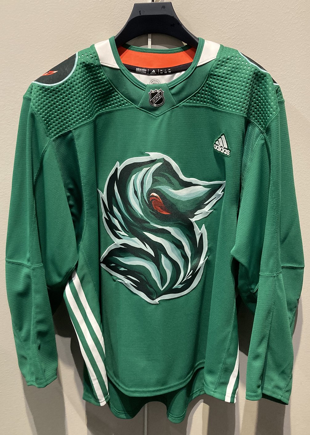
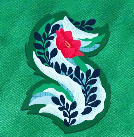
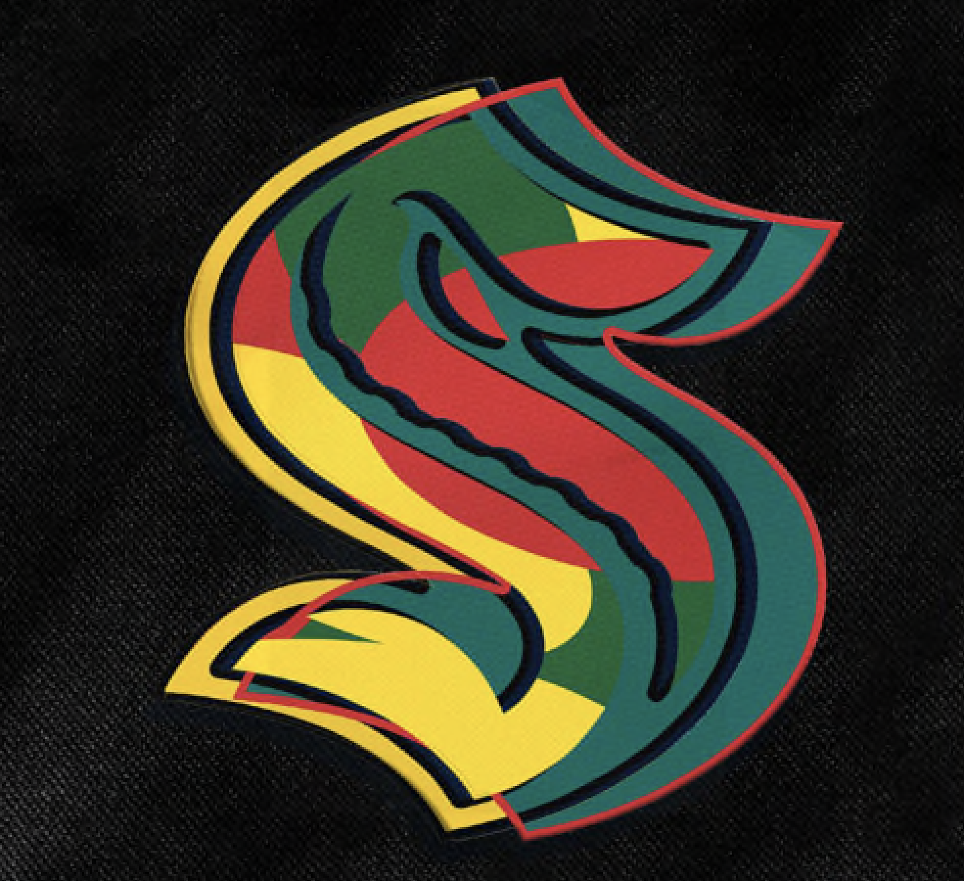
Green Night
April 9 vs. Arizona
Sarah Robbins
White Center
Originally from New York, Sarah Robbins moved to Seattle about a decade ago. She has a passion for art and sports. Her husband plays hockey, and their household is a Kraken-rooting household.
Robbins’ design concept channels the themes of teamwork, community, sustainability, and growth. Her art incorporates “organic elements of diverse shapes, colors and textures working together as one,” while keeping the identity of the “S” intact. The background grid texture is intended to appear man-made to represent Seattleites and our shared environment. Colors will be extensions of Kraken blues of the Kraken logo, plus complementary greens, deep reds, and oranges.
The subtle tentacle in the original primary mark is exaggerated into a long, reaching vine in the Kraken’s deep sea blue colors. The bright red flower mimics the Kraken eye and provides a moment of fierce brightness.

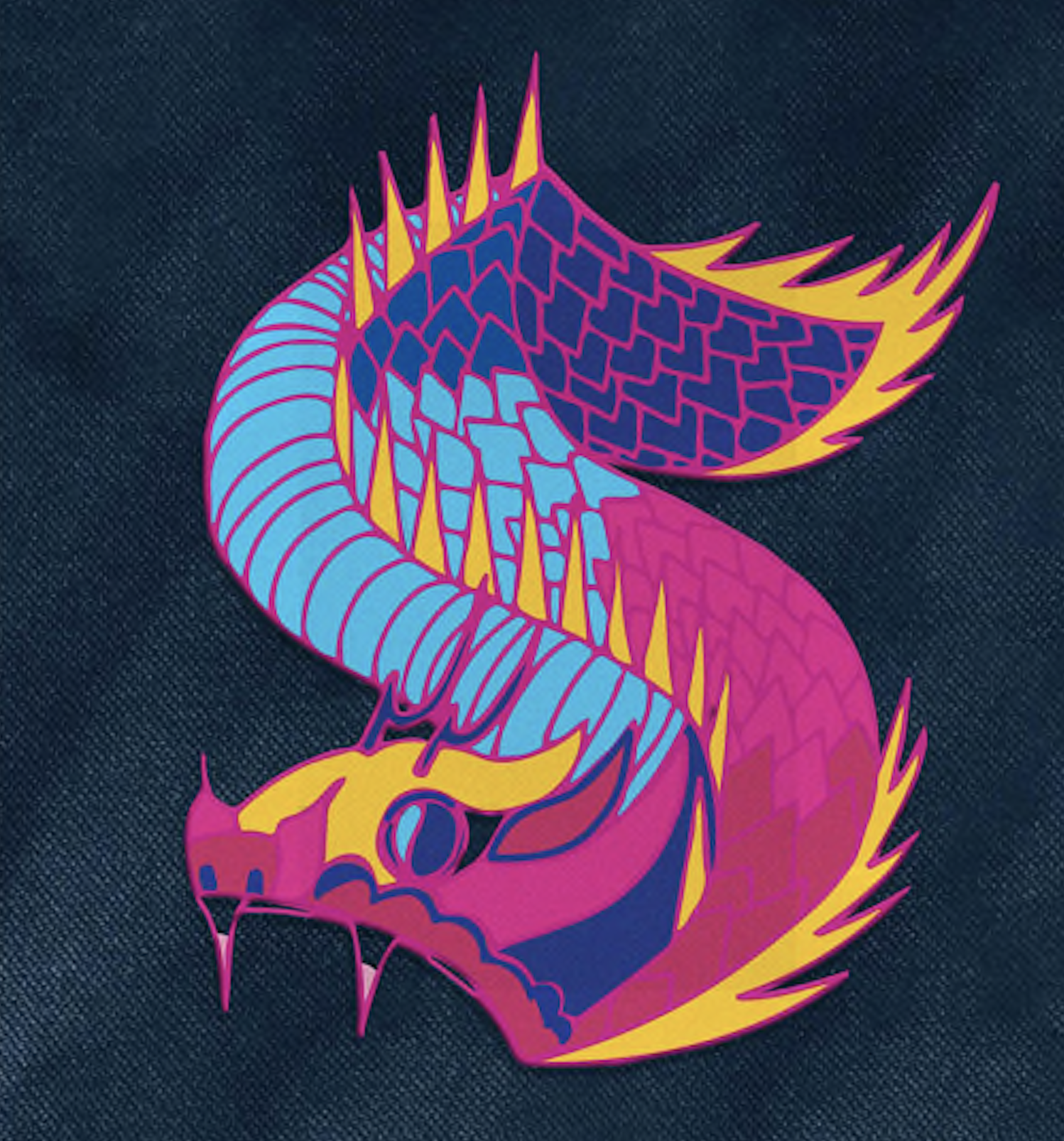
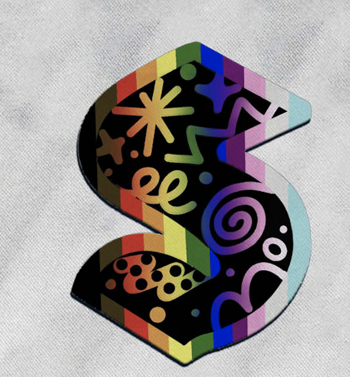
Pride Night
March 28 vs. Anaheim
Nikita Ares
Seattle
Nikita Ares is a Seattle-based painter originally from Cagayan de Oro, Philippines. Her works consist primarily of drawing and painting that include movement, energy, and consciousness.
For the Pride Night jersey, Ares is looking to unfold the bond between the flow of energy and the chaos of movement, which certainly could describe a typical NHL shift. Both the primary and secondary logos are inspired by the vibrant colors and inclusivity tenets of the LGBTQ+ community. Expect the “S” logo to embrace shades of the rainbow to symbolize diversity and pride, while the anchor mark will transform into a heart and rainbow (gotta love that!) to “emphasize unity and support within the hockey community.” Both designs use playful and fun forms to represent the fluidity of gender and sexual orientations.

Black Hockey History Night
Feb 26 vs. Boston
Barry Johnson
Federal Way
Barry Johnson is a multi-disciplinary, self-taught artist and author who works and experiments across all mediums for his artistic expression. He grew up in Kansas, relocating to Seattle after college and a business degree to work in tech as a consultant before becoming a full-time artist.
The Federal Way artist found his muse in the Colored Hockey League (established in 1895 in Nova Scotia) and its founding mission: Provide space for Black men to share space, worship, and team-building. Johnson is honoring the league’s inspiring existence in the fight for identity and inclusion in hockey to this day.
To that end, the “S” mark on the Black History Month jersey highlights Pan-African flag colors, which emphasizes a story about fighting oppression and racism. Those hues are meant to call back to Afro-Canadians who built the foundation for the CHL back in 1895 while reminding us all to continue to fight for the rights of future generations to come.
His take on the secondary and highly popular mark of the anchor incorporating the Space Needle introduces a peace sign to represent “love, equality for all, and non-violence in the face of inequity and civil rights issues.”

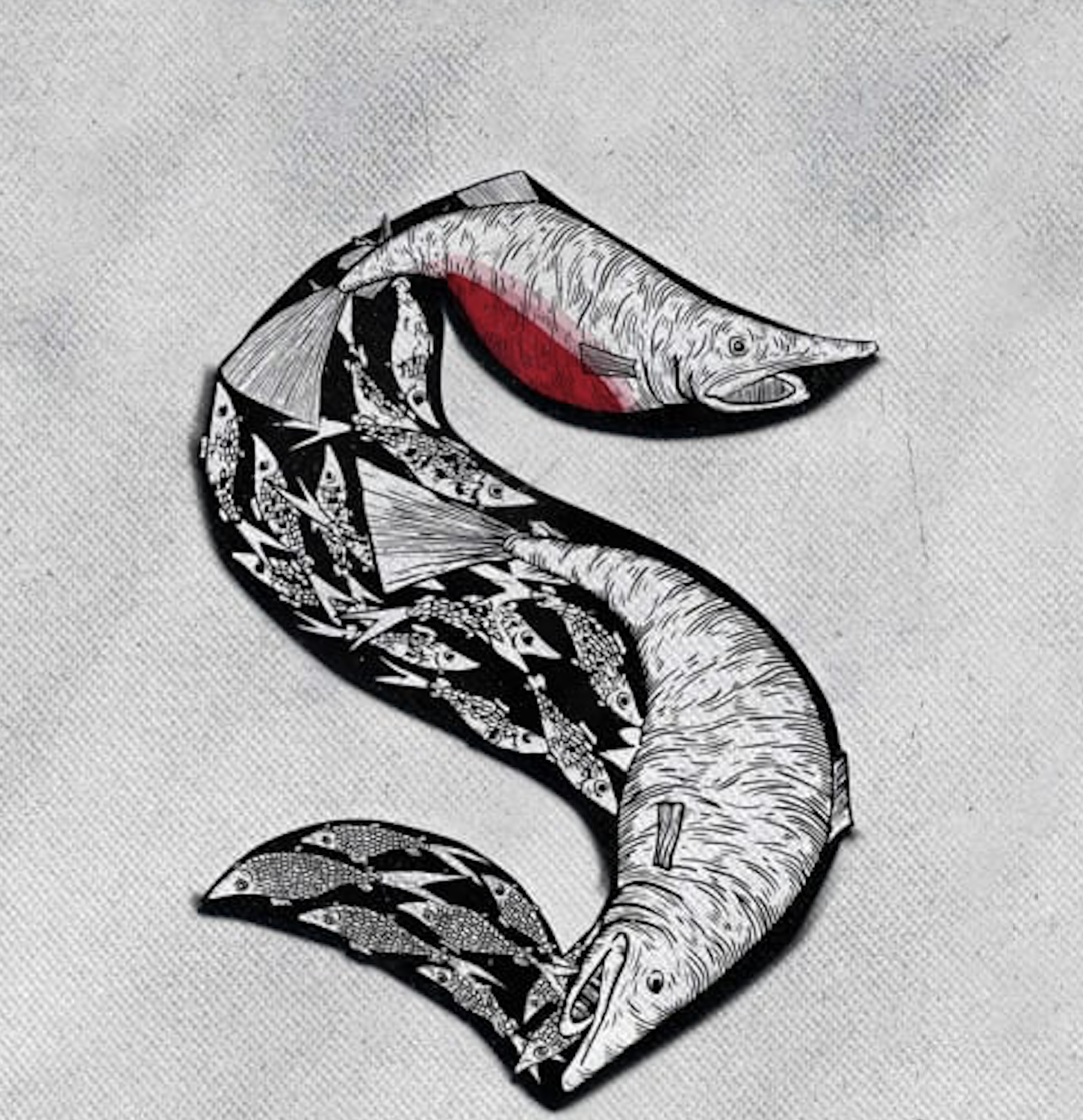
Women in Hockey Night
March 8 vs. Winnipeg
Allie Spurlock
Sitka, AK
A native Washingtonian, Allie Spurlock moved to Alaska to pursue a commercial fishing career. Art has been a lifelong work-in-progress for her, with a focus on making art that reflects life in the fishing town she lives in and the wildlife nearby.
Spurlock’s specialty is creating art that reflects the Alaska Islander lifestyle and has a special fondness for creating her works from “things that have outlived their original purpose.”
As a person working in commercial fishing, Spurlock’s “S” design for the Women in Hockey jersey draws from her daily surroundings, plus “the beauty, detail, mystery and toughness of sea creatures.” She is aiming to intertwine the beauty and toughness of hockey, while also acknowledging women prospering in hard-nosed, competitive worlds like hockey and fishing.

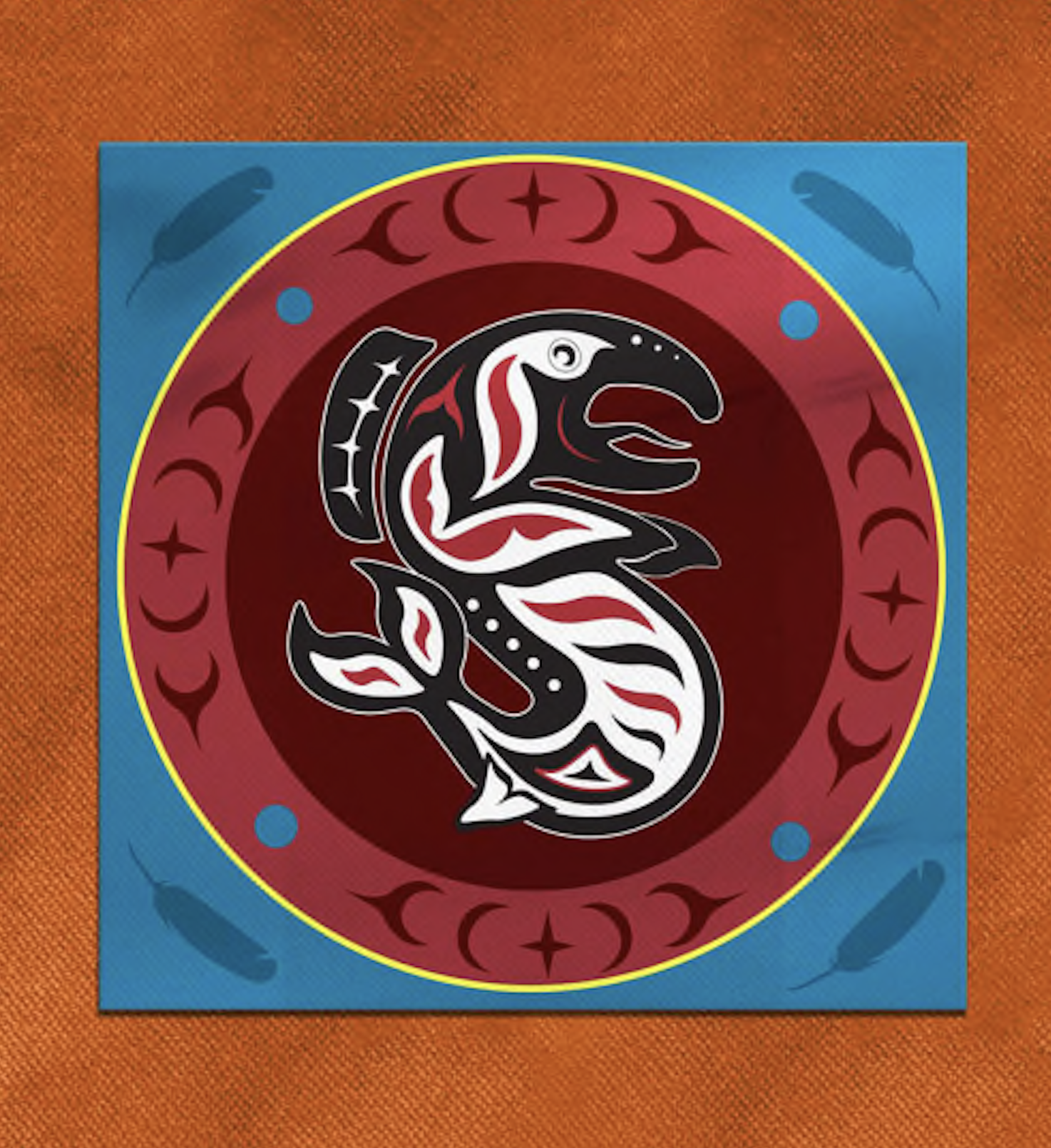
Indigenous People’s Night
Dec. 9 vs Tampa Bay
Bethany Fackrell
Snoqualmie
A current Snoqualmie Indian Tribe member and Navy Veteran, Bethany Fackrell employs traditional Coast Salish patterns in a contemporary way to offer stories, and authentic experiences from her involvement with the Tribe and especially the Tribe Color Guard that enhances community ceremonies, gatherings, meetings, and harvests.
Fackrell’s “S” design honors and respects the native children who never made it home, those who survived, and the families of children adversely impacted by boarding school abuse in British Columbia. Her intention for the artwork is healing.
The primary logo references the Dog Salmon as the “S” with the moon behind. In the tribal story, the Dog Salmon stole the creator when he was a child and after many years the child was discovered by the Blue Jay. The feathers around the “S” and moon represent the Blue Jay’s search for the child.
Before the child in the story was stolen and brought to Earth, the child’s family lived in the sky world and would climb a cedar rope from the sky to Earth. Fackrell’s red cedar rope is wrapped around the anchor weaving patterns of three cedar hats and a ladder. Her creation for player names: The lettering represents the sky world with swirls to represent the mist at Snoqualmie Falls.